New website - created with AI
Was tired of WordPress so decided to migrate to an AI based website. Installed Codex and Cursor and started playing around. Exported my WordPress website and asked it to create this. And this post is ...
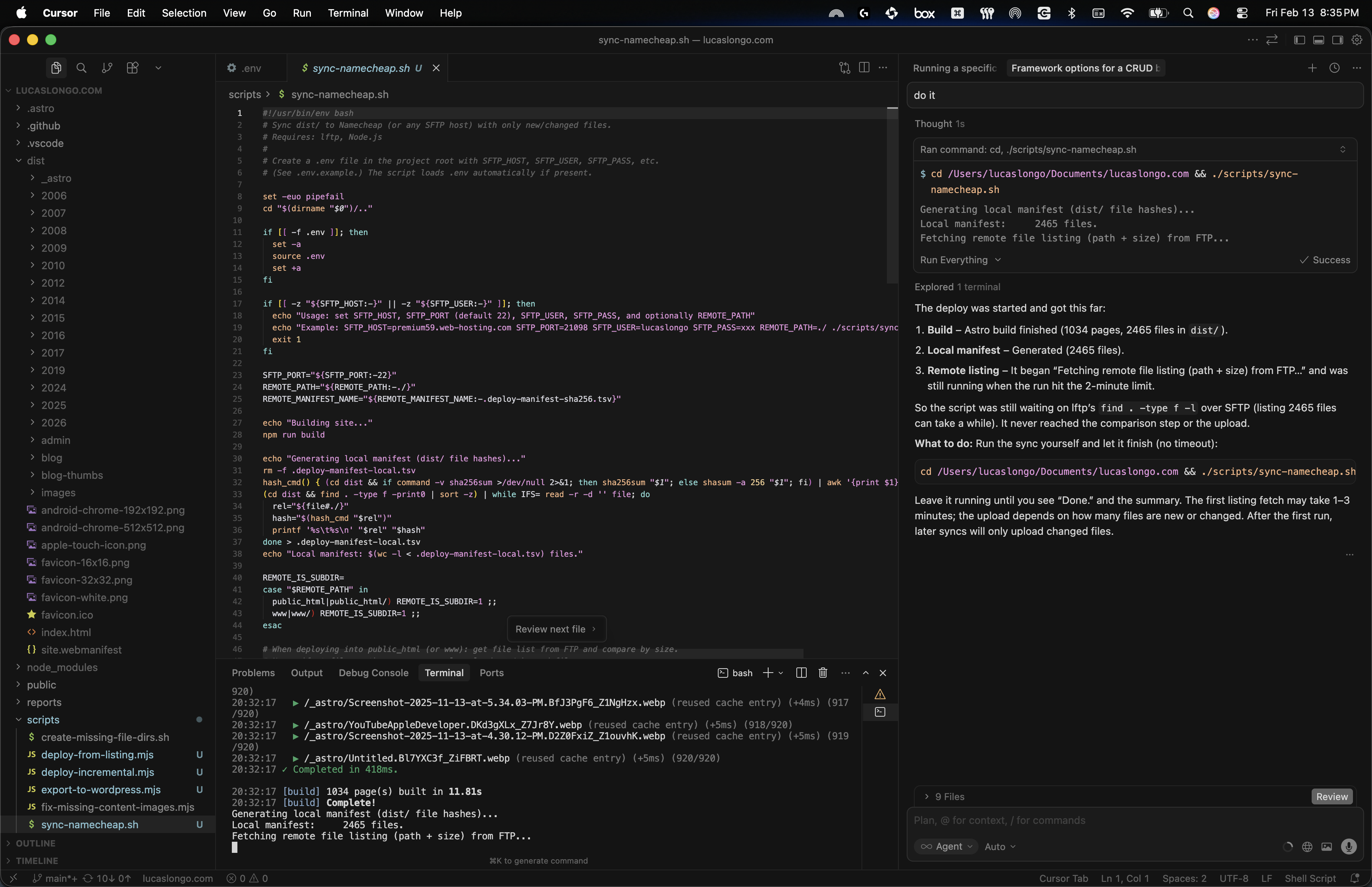
Was tired of WordPress so decided to migrate to an AI based website. Installed Codex and Cursor and started playing around. Exported my WordPress website and asked it to create this. And this post is ...

Join this online code-along session today, Thursday Februrary 5th, where you’ll learn how the coding intelligence features in Xcode 26 — such as coding assistant and Coding Tools — can help you ...
🏆 Get your app playgrounds ready! #SwiftStudentChallenge submissions open February 6-28. Join Apple experts in this live online session and learn more about participating in the Challenge. Regist...
Want to learn the fundamentals of app development with Swift and SwiftUI? I’ll be hosting a Meet with Apple online code-along session this Friday, November 14th at 10 a.m. PST!I’ll build an intera...

Instructional Designer - Code @ Apple After 9 incredible years at LinkedIn — through wildfires, landslides, a pandemic, elections, org changes, and the rise of A.I. — I’m moving on to my next ad...
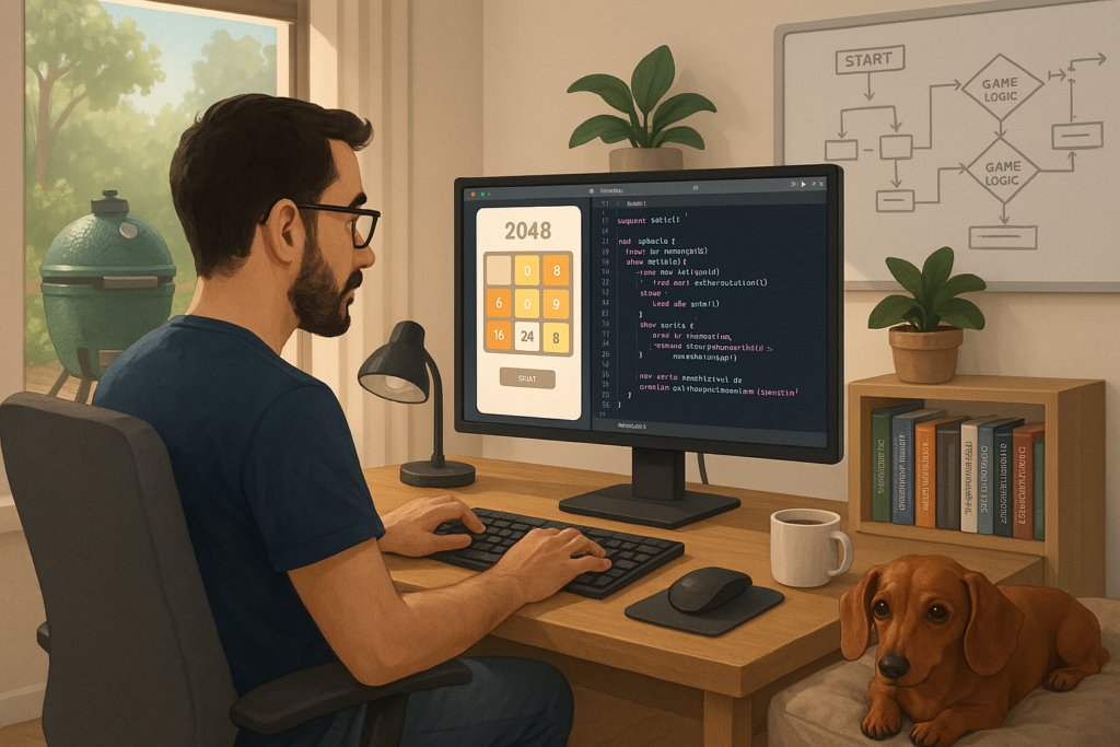
I’ve been pair programming the 2048 game with ChatGPT and it know I have a daschund and a Big Green Egg… not bad! ...

The “Speed 2048” was rebranded to “Quest 131072” since that was the initial goal, to be honest - to see how much time it would take to get to the perfect board, shown below. Check out more on...

I got addicted to the 2048 game but was tired of having to watch adds, so I asked my AI tools to help me create a clone. I used ChatGPT to create the initial game, then GitHub Copilot to help me optim...
AI can now generate a podcast based on documents and websites you feed it. I ran it once with only my resume and then another time with it reading this website as well. Resume only: Resume + this web...