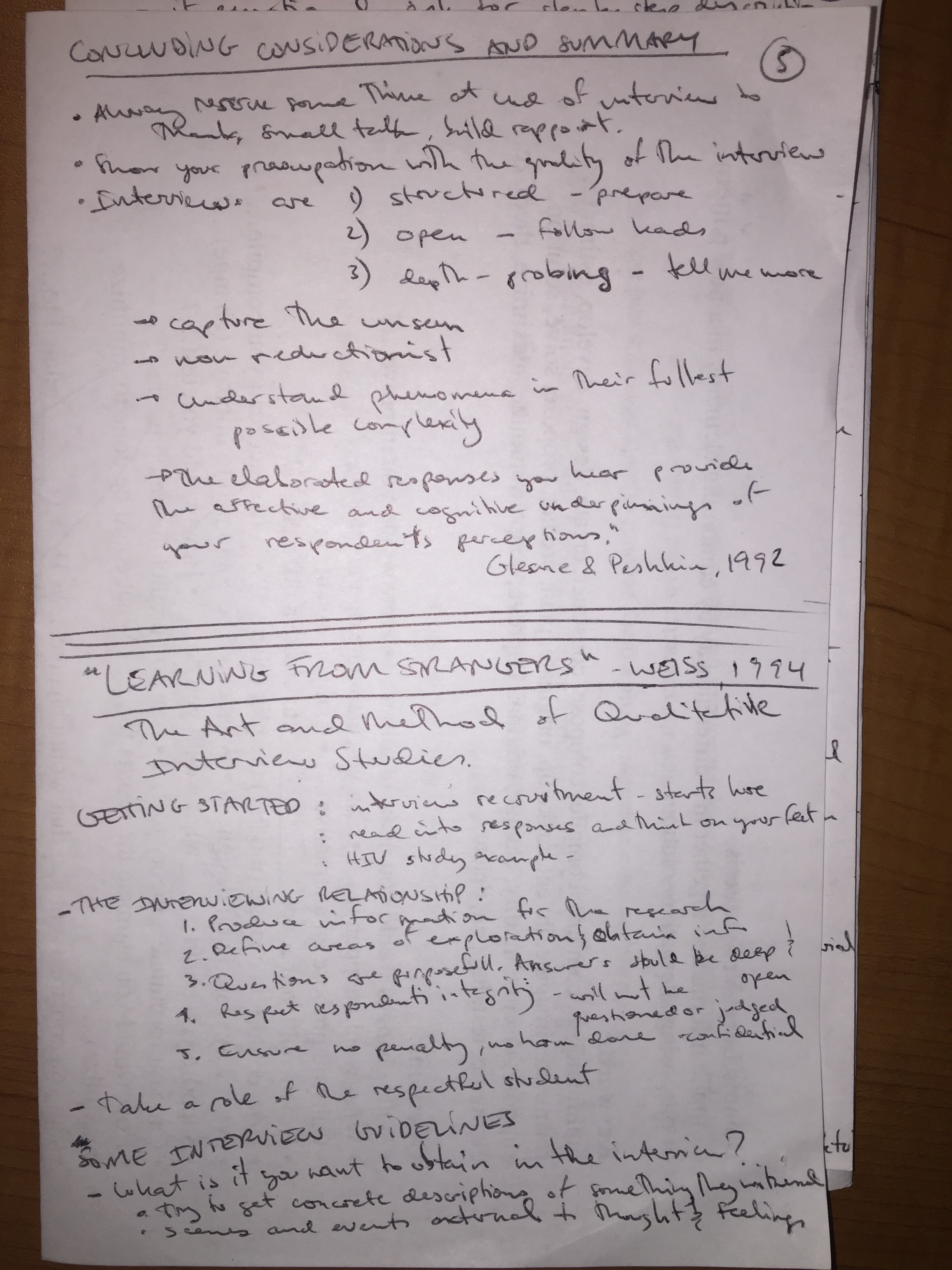
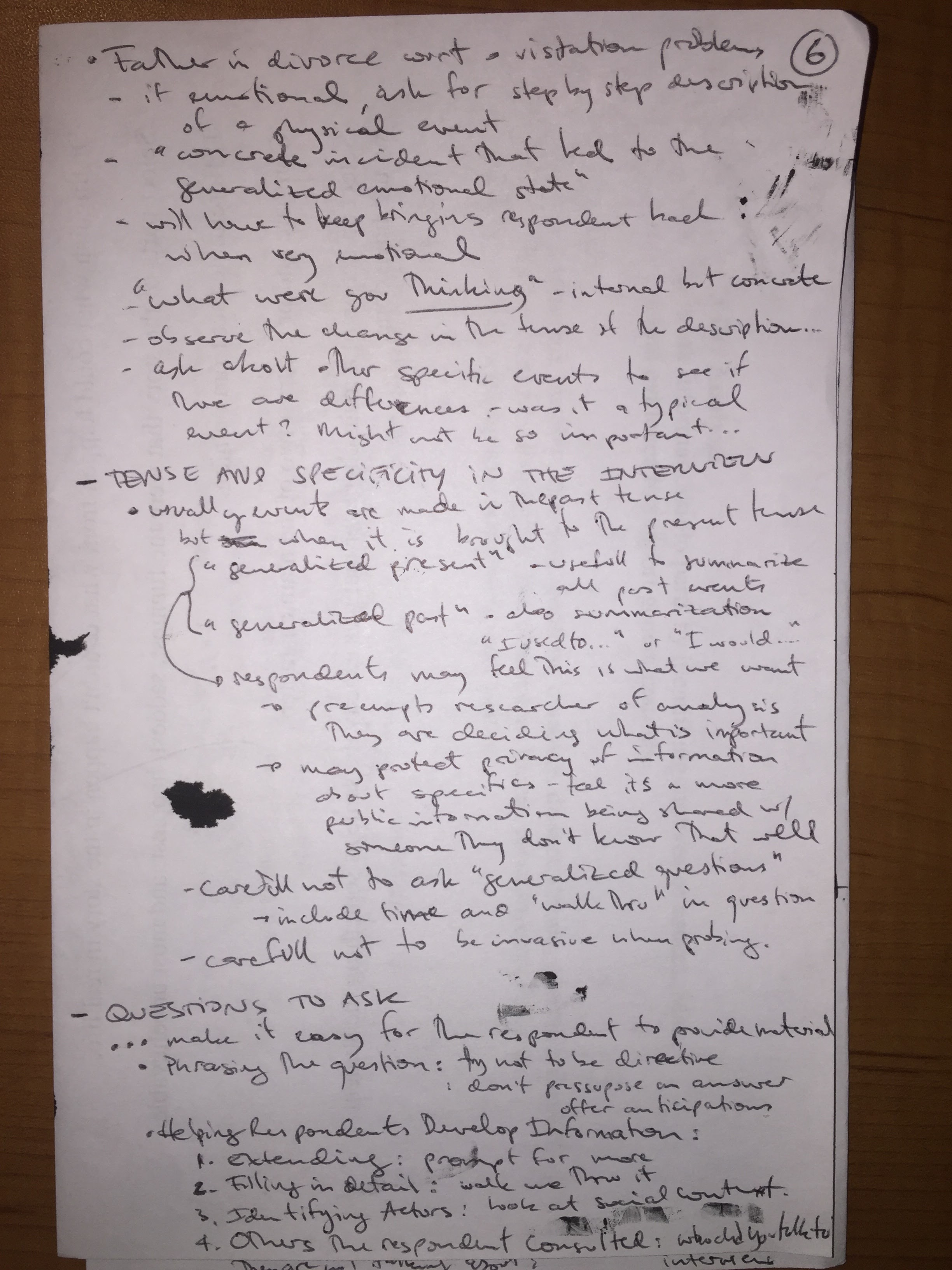
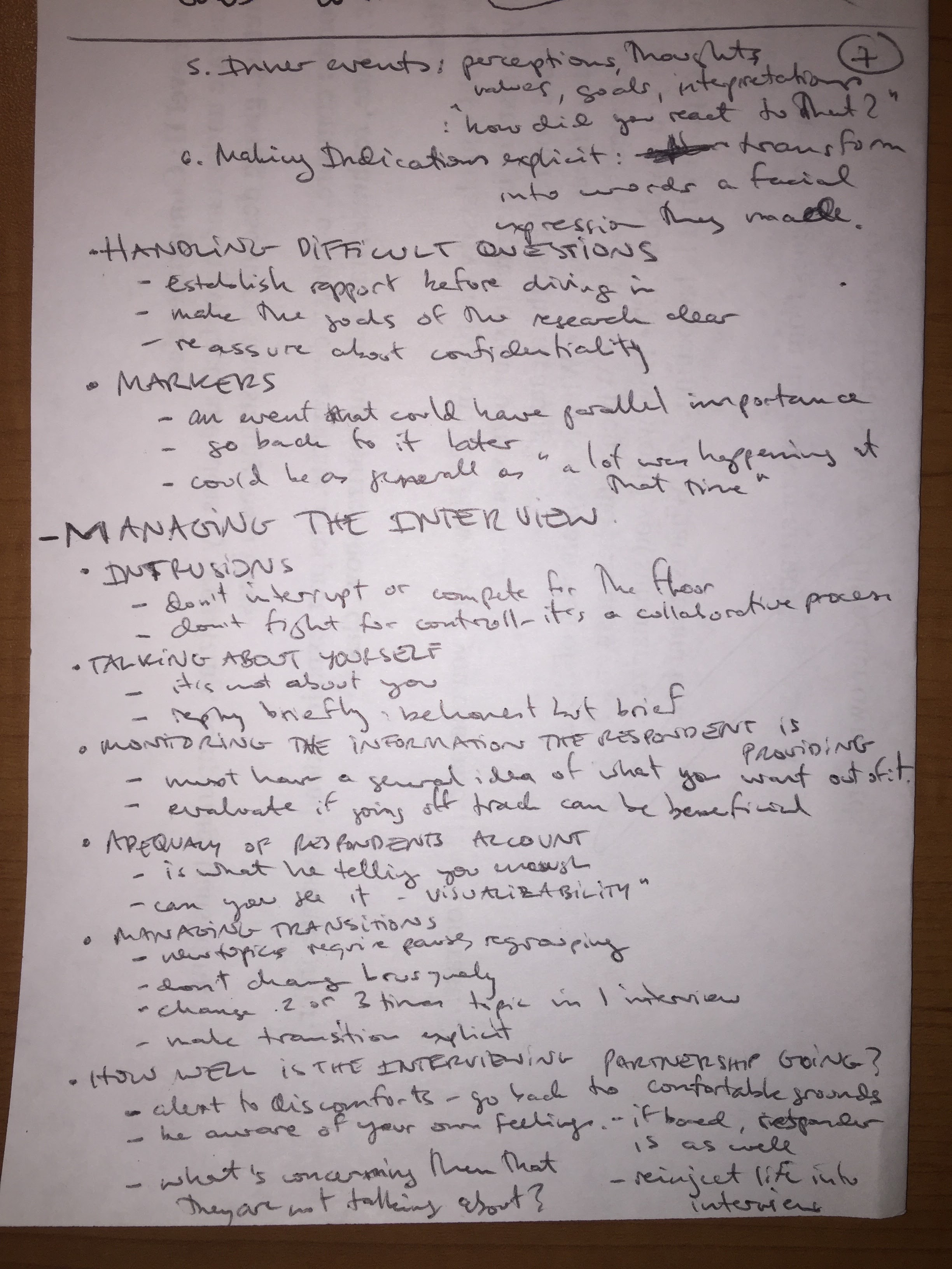
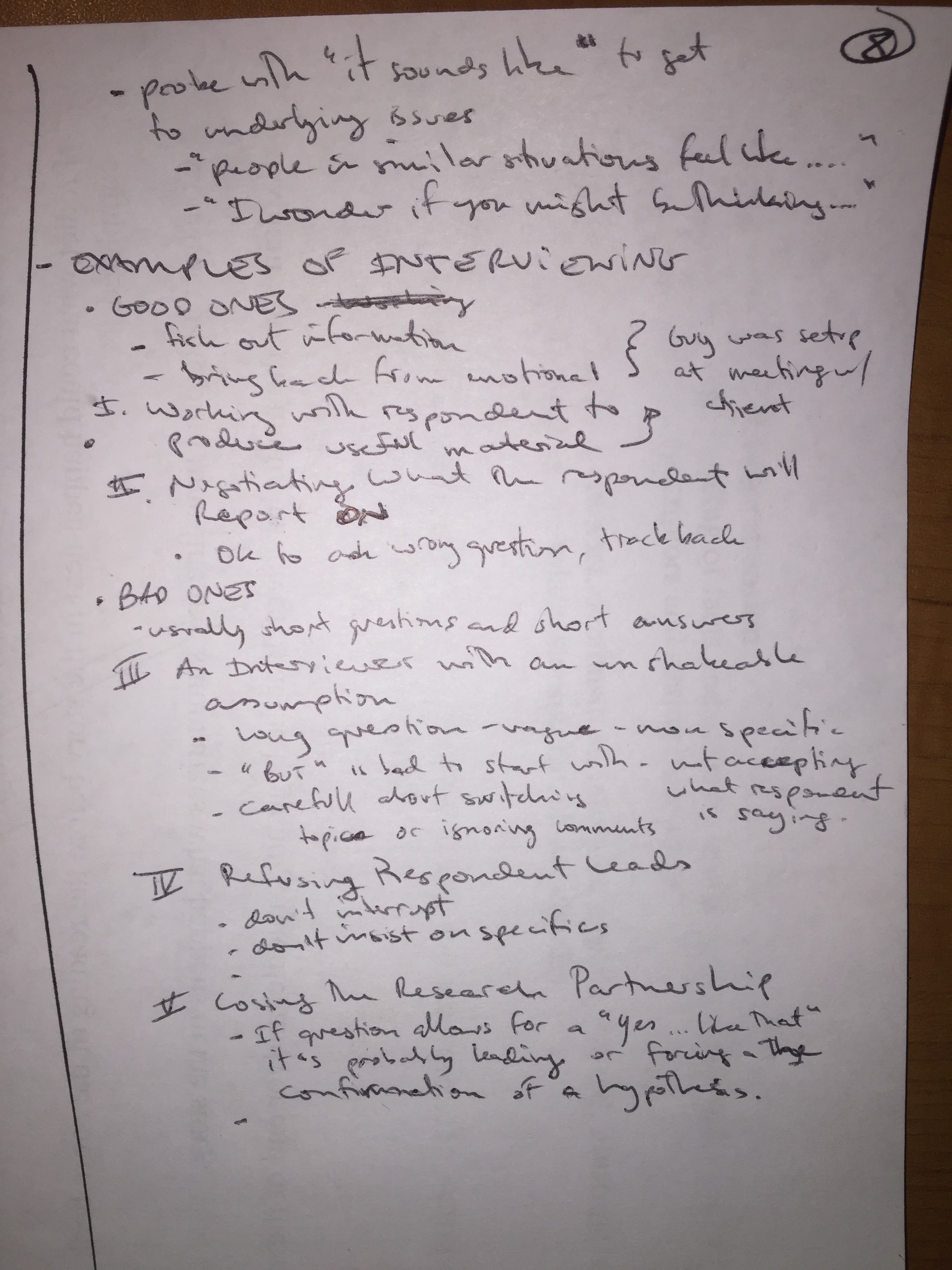
Assignment was to watch up to the 16th minute of this video of a high school biology class and respond…
Notes:


“Investigating Crickets”
Analysis of video from a high school science class.
Role of the teacher
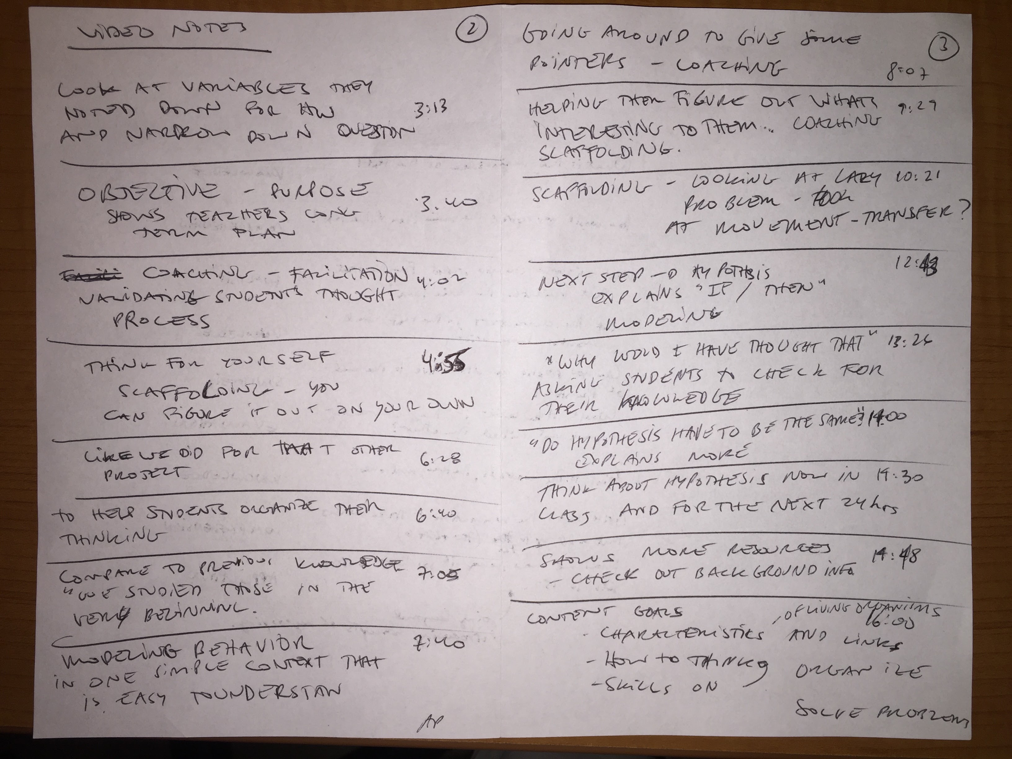
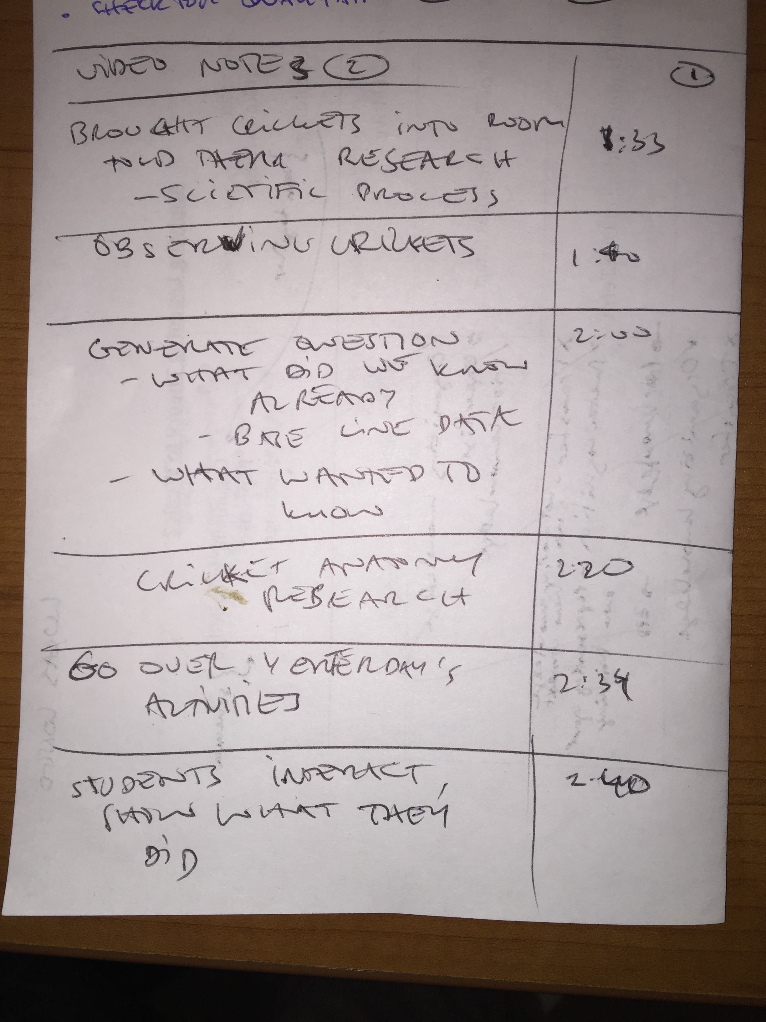
The teacher in this video engages mostly in a facilitative roles. Most of the straight didactic approach seems to have happened before the sessions presented. The teacher references previous classes and projects around minute 6’28” and then around minute 7’05” says, ‘We studied those at the very beginning’. She uses a little of the didactic approach when explaining how to construct a hypothesis but quickly assigns the task of them doing it on their own (minute 12’40”).
The fact that this didactic approach was deemphasized was appropriate with respect to her objectives for the class. She mentions at the end of the video that she aimed for developing their skills on how to think, organize their knowledge and solve problems (around minute 15’50”). Applying a Learner-Centeredness approach, she was able to help students develop the abilities to self-assess their own understanding (Darling-Hammond & Bransford, 2005, pg 74)
There were several examples of facilitation throughout the video where she prompted students to respond to questions she posed as well as working in groups to feed off of each other’s knowledge. Around minute 13’30” she models her own hypothesis and asks the students “Why would I have thought that?”, helping them to grapple with this new idea and get a deeper knowledge of the intent of the word. Around minute 9’29” she works closely with two students who are having trouble in narrowing down their research interests. By having them walk through their notes, she was able to help them decide on what to focus on.
Where the learners are
In order to be successful in the in the learning the teacher expects in this lesson, the students must have some knowledge of biology as well as research skills. Anatomy in specific was a topic so important that a portion of the class was dedicated to explore the subject giving the students the necessary knowledge to move forward. The teacher also expected the students to have some research skills from previous projects in order to be able to complete this task.
To determine what the already know, she specifically mentions around minute 2’00” that after observing the crickets, the students generated many questions about the subject matter, got some baseline data and were able to put forward what they wanted to know more about. I did not see evidence that she was able to assess every student’s questions individually yet a large list was compiled for the class after comparing notes.
The teaching seems to be very well within the students’ zones of proximal development since they were able to formulate their own hypothesis about cricket behavior. I believe that without her conducting the class towards that goal, they would have taken much longer to reach an appropriate response, if at all. She clearly knew where she wanted to take the students in terms of objective outcomes as well as goals for acquired skills and experimenting with scientific thinking. With that she was able to accelerate the process between observation and hypothesis.
Where the teacher wants the learners to be
The objectives of this lesson seems to be exploring the links between the applications and characteristics of living organisms, enhancing the students’ skills on ways of thinking, organizing their thoughts as well as problem solving. The explicit objectives, as she states at the beginning of the video, was to do some research and look into the scientific process of doing so.
The teacher seems to have a very clear sense of longer term learning goals since she focused more on giving the students a toolset rather than testing the “correctness” of their knowledge or sagacity of their observations. In other words, they could have been studying any other insect, animal or thing – the goal was to go through the motions of researching and formulating hypothesis rather than obtaining a profound understanding on crickets.
I believe the teacher successfully determined that the students reached the objective with the hypothesis statements they had to produce at the end of the activity. This statement, if coherent, clearly shows that their observations, thought process and organization of information was attained, generating a significant question that begs to be tested.
Teaching
The students seemed to be working at the “Apply” level of Bloom’s Taxonomy. They clearly had to “Remember” ‘what they had studied at the very beginning’ (~ 7’00”); “Understand” what they observed and thereby generate questions about them (~ 3’00”); “Apply” their knowledge by generating a hypothesis. The next step would be to carry out the experiment, gather data and then “Analyze” the information.
Examples of aspects of teaching and learning in the teaching episode:
- Building off of prior knowledge
Around minutes 6’30” and 7’00” the teacher references a previous project as well as a previous lesson saying specifically that they had already come across the concept or knowledge she was putting forward at that moment.
- Organization of knowledge
After the observation period, the teacher organized what the students knew and what they wanted to know to find out that they needed to learn more about the cricket’s anatomy. A clear example of organizing their knowledge, both past and future.
Around minute 8’00” the teacher goes around the classroom talking to the students about their progress and would give insights and question their work with the intent of helping them reach their final goal. She also modeled her own thought process while coming up with a hypothesis, giving the students a baseline to compare with.
At the start of the video, a girl observes the muscles of the cricket and remembers that grasshoppers have similar structures, implying that crickets can possibly jump as well, and thereby showing that she was able to transfer some of her knowledge into the current context.
The teacher models her hypothesis creation process around minute 13’20” showing them how she arrived at her final statement as well as asking the students to think about why she thought the way she did.
The process of creating their own hypothesis was an example of guided practice where the teacher models the behavior and the students engaged on the same task with their groups.
Even though it seems like all of the activities were done in pairs, the teacher encourages the students to think about their hypothesis during the next 24 hours – probably meaning that this would be an individual task to practice critical thinking (~14’30”)
- Checking for understanding
The teacher on several occasions asks the students to contribute with their understanding of the content. She asks if ‘hypothesis have to always be the same’ (~14’00”). She also goes around the class to verify what were the ‘variables’ they noted down for homework showing they thought about the matter.
There was little evidence of direct feedback during the video I thought. She simply agreed with whatever the students were saying. On one occasion she could’ve grabbed to opportunity to help the student (~4’55”) but instead told them that they should think more about the problem and that they could ‘figure it out by themselves’. Perhaps I am misinterpreting her reply and that she actually meant this a ‘lesson’ in being persistence?
References:
Darling-Hammond, L. & Bransford, J. (Eds.). (2005). Preparing teachers for a changing world: What teachers should learn and be able to do. San Francisco: Jossey-Bass.
Wiggins and McTighe (2007). What is the teacher’s job when teaching? In Schooling by design: Mission, action, and achievement.

